A New Hue on the Horizon: Pantone Color of the Year
By Mary Parker
Since its debut in 2000, the Pantone Color of the Year tradition has emerged as a foundational pillar in the design world, offering far more than just a prediction of industry trends. This annual selection by Pantone LLC, a global authority on color and provider of professional color language standards, serves as a mirror to the global zeitgeist, capturing the emotions, attitudes, and collective needs of society at any given moment. As an interior designer, my appreciation for this announcement lies in its ability to guide and inspire the creative community, offering a unifying theme that resonates across the vast spectrum of design practices.
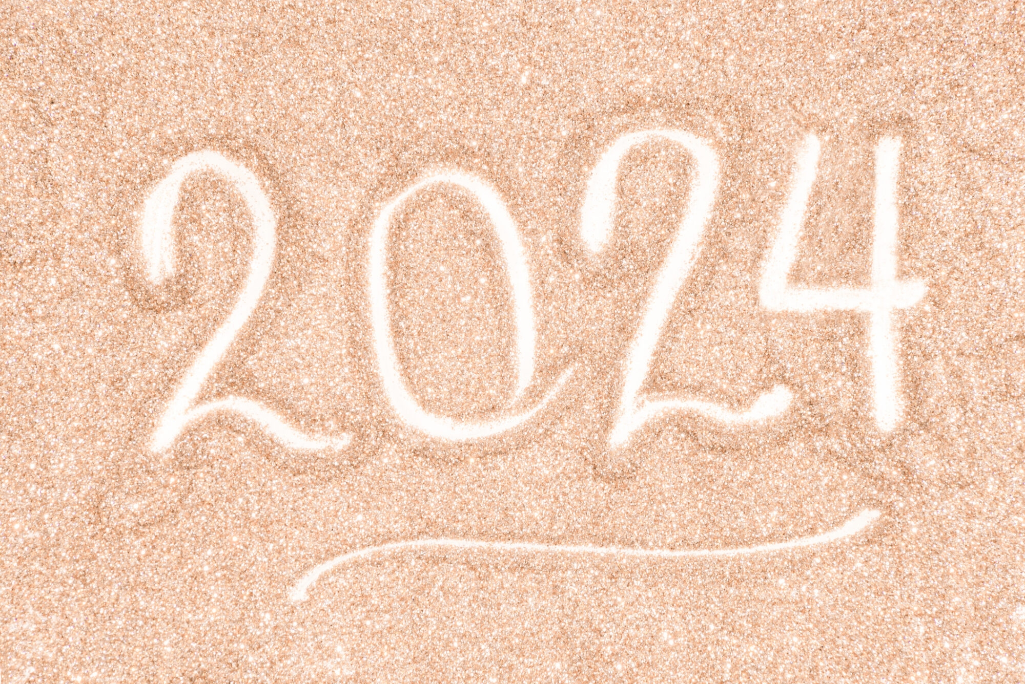
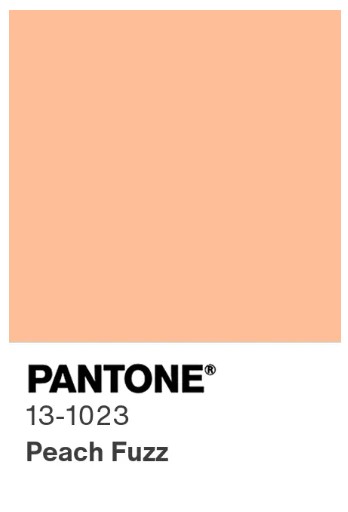 For 2024, Pantone has chosen “Peach Fuzz” as the Color of the Year, a hue that embodies warmth, vitality, and a soft, inviting optimism. This choice is the result of Pantone’s comprehensive analysis of global cultural trends, including shifts in art, fashion, entertainment, environmental conditions, and socio-economic factors, showcasing a dedication to capturing a vision that is both timely and timeless. “Peach Fuzz” is a reflection of a world poised on the cusp of renewal, aiming to bring a sense of comfort and buoyancy to the forefront of our collective consciousness.
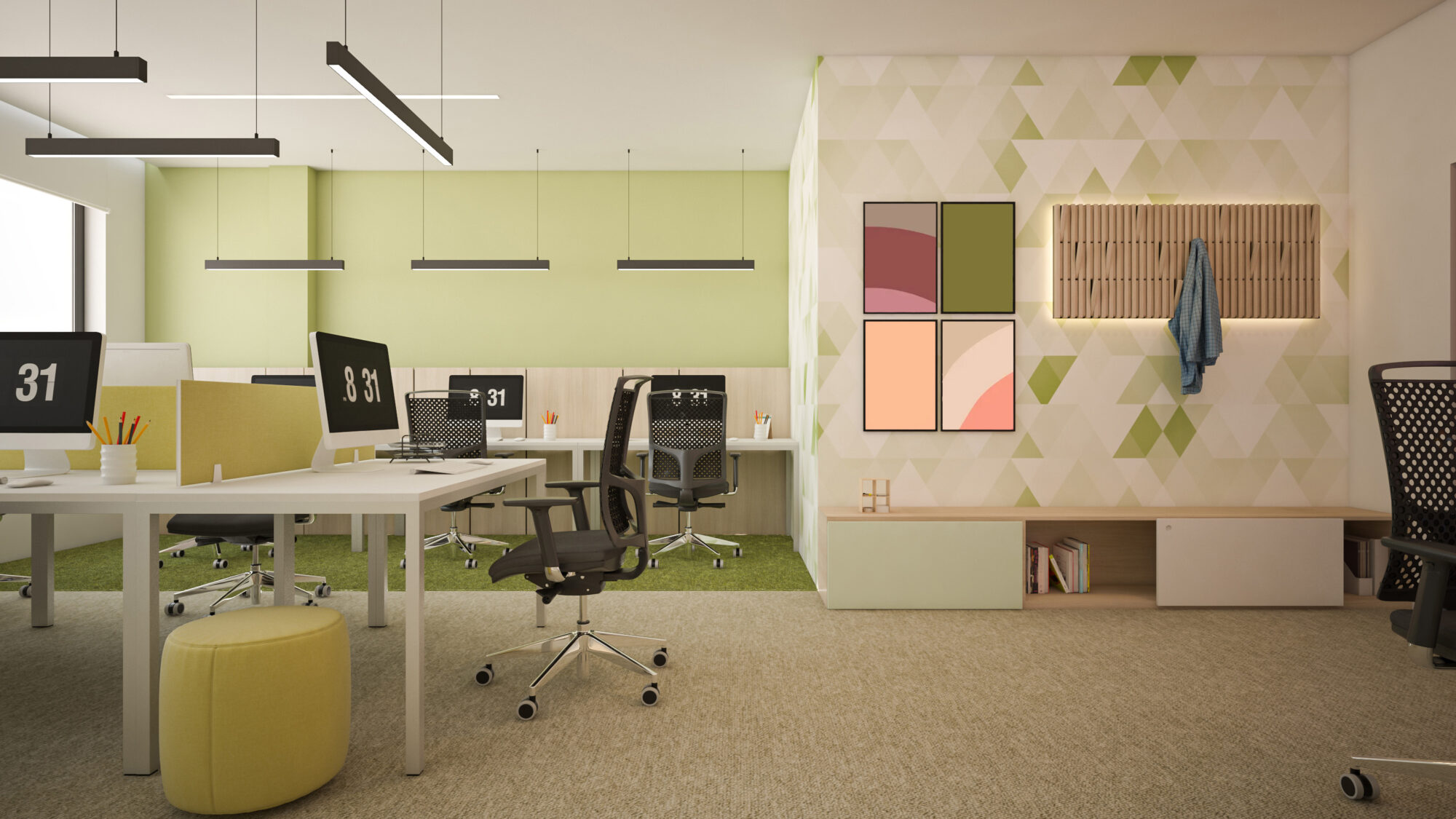
From a designer’s viewpoint, “Peach Fuzz” is a versatile tool, shaping the way we approach space, mood, and emotion within interior environments. Its significance transcends aesthetics, affecting the psychological and physiological responses of space occupants. This understanding guides my approach to design, as I consider how “Peach Fuzz” can enhance the functionality and emotional impact of a space, making it a color that not only aligns with current trends but also connects deeply with our shared human experience.
For instance, in healthcare environments peach hues can help to support healing and comfort, by evoking joy and a sense of warmth. Its strategic use in patient rooms, lobbies, and staff areas can help in crafting spaces that not only promote healing but also uplift the spirits of patients, families, and healthcare providers. Peach hues can also be the perfect balance in care for aging and Alzheimer’s where patients may have a hard time discriminating between cool colors such as blue and green. The selection of this color, grounded in an understanding of its psychological effects, underscores our commitment to designing healthcare spaces that are not just functional but truly nurturing.
In educational settings, from K-12 schools to higher education institutions, this color can energize learning environments, stimulate creativity, and foster a sense of community. By integrating this hue into classrooms, common areas, and exteriors, we aim to create spaces that are conducive to learning and exploration. The color becomes a tool for enhancing concentration, encouraging collaboration, and making educational facilities more welcoming and stimulating for students and educators alike.
For civic and community projects, this versatile color can help in embodying the identity and aspirations of a community. Its use in public spaces, municipal buildings, and community centers can signify unity, vitality, and a forward-looking perspective. This approach not only beautifies public spaces but also plays a crucial role in strengthening community bonds and fostering a sense of pride and ownership among residents.
The historical palette of Pantone colors showcases a rich tapestry of societal narratives and design evolution over the years. Each color, from the calming Cerulean of 2000, which sought to provide comfort at the dawn of a new millennium, to the soft and optimistic “Peach Fuzz” of 2024, tells a story. These colors mark the pulse of time, reflecting our collective joys, challenges, and transitions.
The introduction of the Pantone Color of the Year has fundamentally shifted the dialogue around color in design, encouraging a more narrative-driven approach. It prompts designers to think critically about the implications of color choices, pushing the boundaries of traditional design to incorporate color in ways that are both innovative and deeply meaningful.
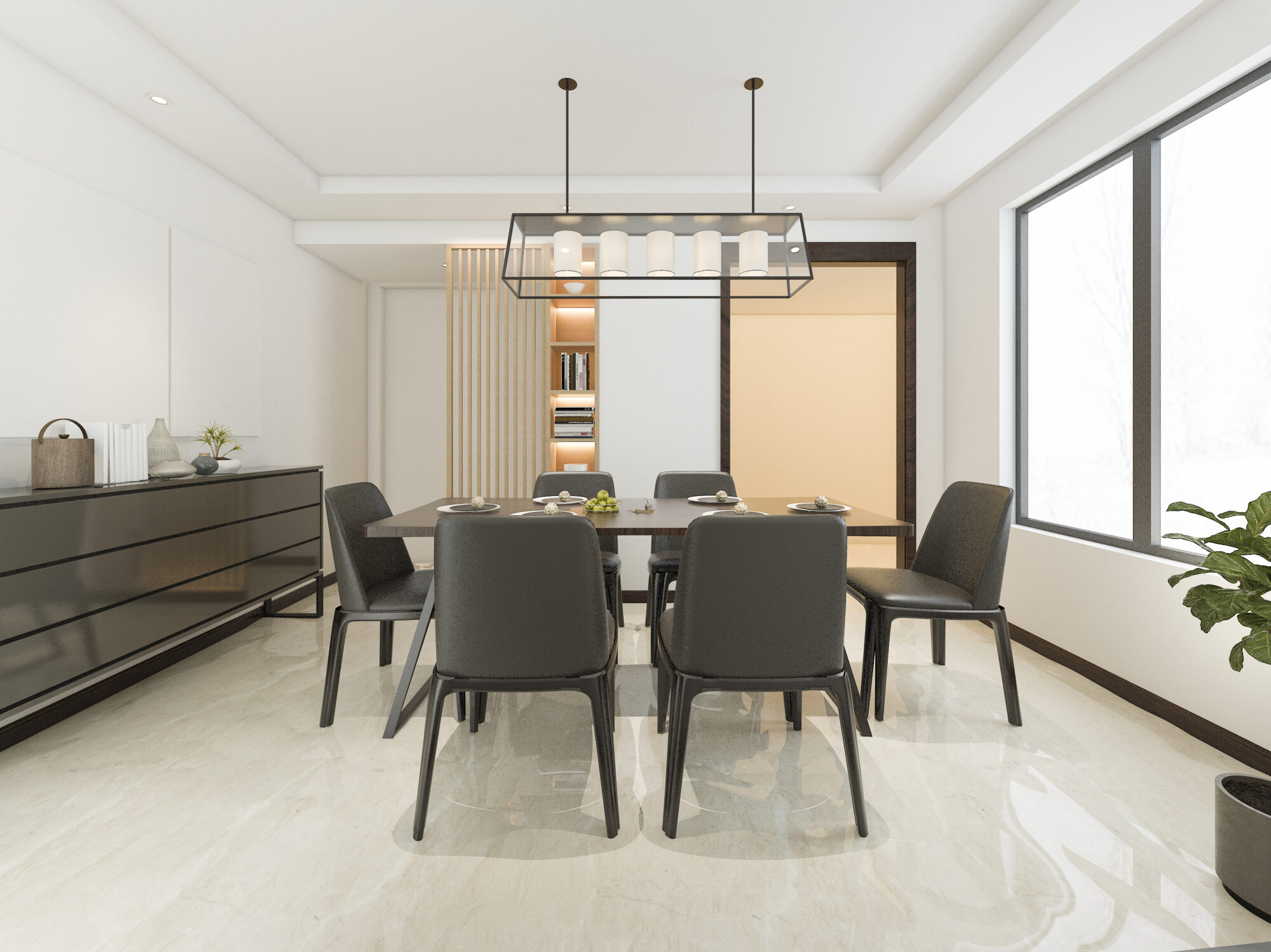
In practice, leveraging the Pantone Color of the Year allows for the creation of spaces that are not only visually compelling but also deeply resonant with the current cultural and emotional landscapes. Whether through a bold feature wall, thoughtful accents, or tactile finishes, this color becomes a narrative device within the designer’s toolkit, enabling the creation of environments that reflect, challenge, and inspire the human spirit.
In today’s complex world, the Pantone Color of the Year stands as a source of inspiration for the design community, providing a vision that helps shape the future of our interior spaces. It encourages us to explore new horizons, innovate beyond the conventional, and forge connections, emphasizing that color transcends mere aesthetics to touch the very essence of our collective human narrative. At EAPC, we embrace color as a crucial component of our design toolkit, a reflection of our commitment to crafting environments that enrich the lives of everyone they touch.